Designstudio
Mobile

Introduction

This project was given to me and four other students by Halmstad University. This was our second big project over all and we were all excited to start working again. The brief we got was to do was to update the current website that the students of the univeristy uses, hh.se/student. The main problem that they were facing was that the majority of students were not using their website and therefore missed out on news, special events and much more. On the other hand, the students who were using the site had a lot of problem finding what they wanted because it was so disoriented and confusing to use the website.

We solved this problem with a website where the students easily could access all the information in one place, they could see their upcoming lectures and what special events they were registered to. During the four weeks with this project we identified the primary aspects we wanted to deliver with our solution was accessibility and simplicity. The main problem we were facing was the coding inexperience we had in the team. In the end we provided both a coded prototype and one made with the help of adobe XD. The group dynamic was also a bit problematic but in the end we delivered what was expected of us.

Down below I will describe our process from researching the topic, defining the problem and finally showing some solutions we came up with. If you want to read the full report it is available by pressing the big orange button (PS. It is in Swedish).
Research

This problem was solved with methods such as Goal Directed Design and Scrum. The team also interviewed students as we found they were the main user of the website. From the interviews we would start to notice a pattern around simplicity, relevancy of information and effectiveness. All these terms helped us lay the foundation of how and what we wanted to create. The students wanted easy access to their own personal information, such as classes, meeting and so on. Whilst also being able to easily find information about upcoming events, links to different platforms and so on.

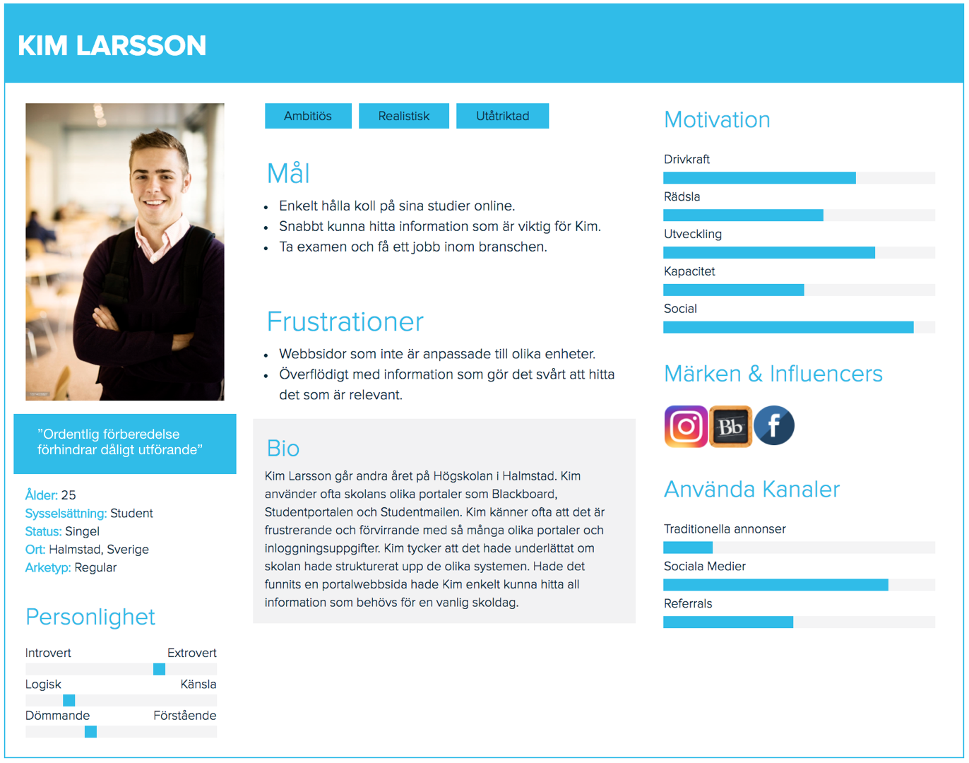
Our main persona - Represents the students in this project and was created to help us design towards a single person instead of an entire target group. His goals are to keep up with his studies and deadlines, aswell as being able effectively find information online. He does not like when websites are not responsive and when there is too much information on a website, leading to information overload.

One or more personas - In this particular project we chose to only focus on one single persona. The reasoning behind this was simply because another persona would feel redundant and not add any value to the service. The main target group is the students and if another persona would be created it could change the focus to something else. If we had to add another persona it would most likely represent either the parents or a caretaker.


UX Problem

The main design problem that we identified was ease of use and simplicity. We wanted to create a website that would make the life of a student a bit easier. It would also gather all the different platforms the students uses and make it easier to access them. At the moment the students are overloaded with information when accessing the student part of the website, which have led to that the students do not want to use the website. Our main focus is to reduce the amount of information on the website, only keeping the most relevant information. This would lead to a website that is more comprehensible and more simple to use. The interviews showed us that the most important features include the schedule, personal information for each student and simple navigation to other important external websites.


Design Solutions

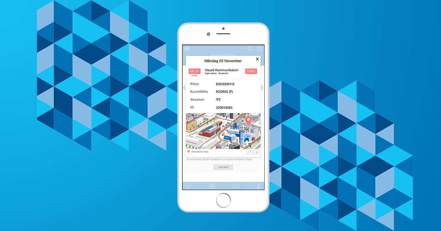
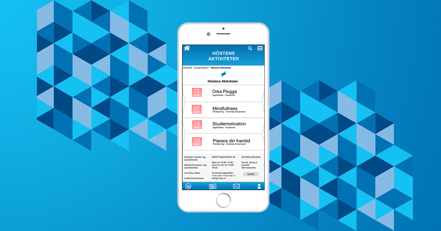
We chose to keep in simple with big and informative icons and text. The search bar was also a feature that many students requested to be redone or updated. We decided to include it on the main screen. We also ended up with three ways to navigate and keep track where you are located on the website. The three include the icons, the search bar and the menu in the top right. Users usually use different navigation techniques and we wanted to provide a couple ones to satisfy as many users as possible. Couple of examples from the solution we ended up with. First picture is the first screen the students with navigation. Second picture is a calender with a map and which classroom the lecture is held in. Third picture is also a calender but with activities that will occur during the autumn at the university.

Feel free to press any of the pictures below to get a larger view of them.

Navigation Screen Calender screen with map Calender screen with activities
×


Final Thoughts

During this project I was the project leader during this project which was new to me. Leading and managing was tough, but in the end I learned alot about myself and how to treat the others in the team. I have never designed where the main platform is a mobile. From this I learned that important things should be in reach on the thumb and how simplicity is key when designing for mobile. Another lesson from this project is that we ourselves are students and our core target group were students so we had to put our own opions aside for this project, even though we had many. This part was the hardest for us, not letting our own opions take over.

All in all, this project was really fun and also very challenging with new things to learn and new things to adapt to. This project gave me a new perspective on how the project leader usally works and what decisions needs to be made. Since this was our second big project it also gave me better insight into how every project is different from eachother.


Feel free to contact me

Looking for a efficient individual who never gives up? If so, do not hesitate to contact me!